Design guidelines for building blocks
How to make your blocks feel intuitive, easy to use, and beautiful across every application
April 24th, 2022


This guide is for developers who want to build blocks with the Block Protocol. The protocol allows you to build blocks that will work in any application that also follows the protocol. It acts as the communication layer between an application and a block. The block and the application don't need to know anything about how the other is built. They only need to follow the protocol to work seamlessly together.
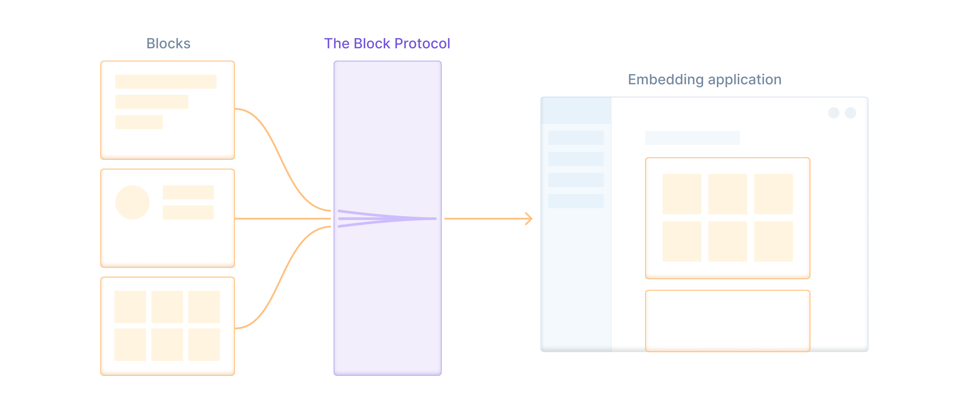
This opens up a world of possibilities; as a developer, you can build any block you like and publish it to the Block Hub or npm. Other developers can then download and use it in any protocol-compliant application.
This also raises some new challenges though. For your blocks to be successful, loved, and widely used, they need to look and feel great across a wide variety of contexts. Which means you have to design them well.
This doesn't mean add fancy gradients and drop shadows to everything. It means following these two principles:
- Blocks should be visually simple, minimal, and blend in with their surroundings
- Blocks should follow tried-and-true interaction design principles
The first principle helps blocks feel at home in the applications that use them. Each application will have its own visual style and set of design conventions they follow; a design system they've worked hard to establish and keep consistent across their product.
We've designed the protocol with this in mind; we allow applications to pass styling variables into blocks such as primaryColor and fontFamily (more on this below) which helps them match the visual styling of their environments.
There's more to design than visual appearance though. Blocks need to behave predictably and consistently for the people using them. This means being both internally consistent, and consistent with the way most other websites on the web work. This principle is known as Jakob's Law — users spend 99% of their time on apps and websites other than yours, and they expect them to all work the same way. There is no need to reinvent the wheel or the dropdown menu.
There is a much higher risk of inconsistent behavior when every block in an application is designed and built by someone different, without any shared conventions or rules. We've all felt the frustration of trying to use an app that has 99 button colors, icons that change meaning across screens, and labels that sporadically switch between “cancel,” “discard”, and “delete.” These small frustrations add up and will quickly deplete a user's patience.
Thankfully, you can avoid most of these usability problems by following our visual styling principles and best practices when you're creating blocks.
Styling Block Protocol blocks
The links in this section point to old versions of Block Protocol utilities. You should always use their up-to-date counterparts.
We've set up our block starter template with a couple of helpful CSS files:
- A CSS reset file
- A base styles file with a set of root variables you can adjust
Our base styles file is lightly opinionated and sets up a styling base that will help your block look and feel similar to others.
It comes with a default palette of colors you can use, a typographic scale, a spacing scale, and other similar base styles. You can read more details about what the base stylesheet includes in our documentation.
Accepting styles from embedding applications
The blocks you build will be usable inside other applications; we call these "embedding applications."
The protocol gives embedding applications control over the way blocks appear within them. We give embedding applications the final say over how a block looks, as they have more context about the environment it lives within and how people will use it.
Every Block Protocol block you build should accept a styleVariables object that the embedding application can pass in.
This object defines a set of variables that control the basic styles of the block. We've designed these to maximize consistency and simplicity within your block. You can see the full list of these in the styling section of our documentation. Here's a rundown of the major categories:
- Colors - a range of shades for neutrals, primary, secondary, tertiary, warning, and danger.
- Typography – font family, base size, scaling ratios, and line heights
- Spacing – base size and scaling ratios
- Borders – weight, colors, and radius
- Box shadows
- Icon sizes
These styling variables can do a lot of the heavy lifting to help blocks match their surrounding environment. As a block developer, you should make sure the markup in your blocks uses these styling variables to make life easier for the people using your blocks.
Embedding applications can also pass a plain old CSS file into the block if they need to manually override specific styles and layouts. This should be a last resort though, as futzing with CSS selectors can get messy and may end up affecting the core functionality of the block.
Usability and UX principles
No matter how beautiful a block looks, it's not worth much to anyone if it's difficult to use. Soft drop shadows and smooth gradients aren't going to delight the user if they're furiously trying to find the “save” button, and you've stashed it inside a dropdown menu that's too low contrast to see.
Usability and user experience design (UX) is a whole discipline in its own right, and we can't cover everything in this guide. We're not expecting you to become a UX designer before you can start building blocks. However, knowing the basics of UX and some of the most important principles will go a long way in making you a better block builder.
1. Keep it vanilla
There's a reason designers won't stop banging on about minimalism and simplicity. Adding in fancy details, decorations, or flashy animations that don't need to be there will increase the visual complexity of your block. It may take users longer to figure out how to use the block, or may get in the way of whatever they're trying to do with it.
In practice, this means avoiding loud, wild visual design choices. Like adding a leopard pattern to your form background, or using a funky 1960s font for labels.
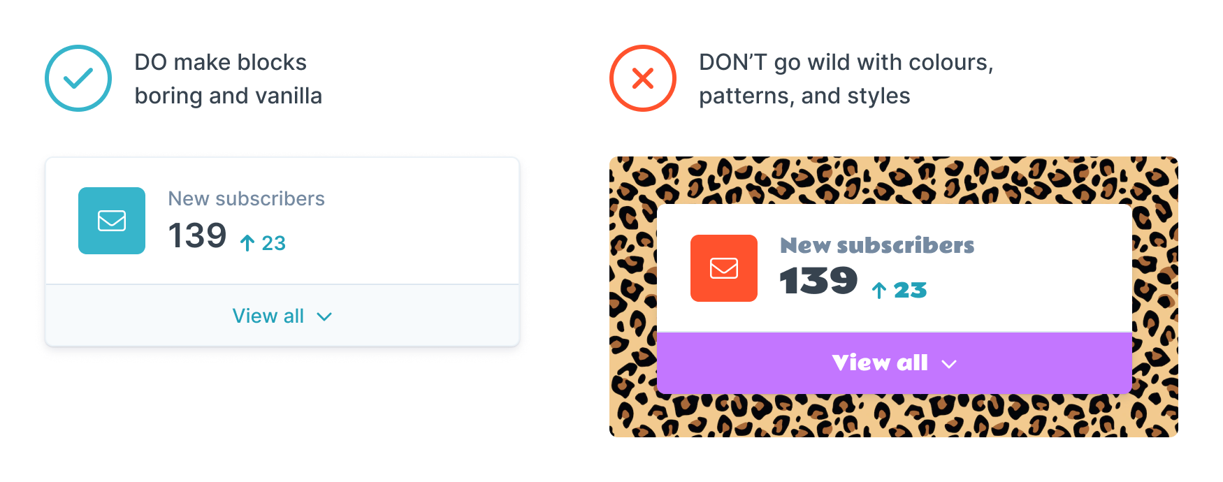
Because blocks will be used in a wide variety of situations, it is extra important to make them boring enough to blend in with the wallpaper. Use color sparingly, and only to highlight active areas or draw attention to important elements like call-to-action buttons. Avoid noisy patterns or textures. Only use animation for subtle transitions, or to communicate the state of the elements to users.
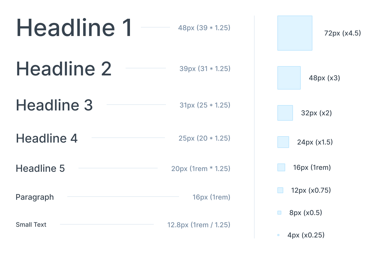
2. Use standard scales for spacing and typography
Nothing makes a design look better than consistency and ratios. Basing both your typography and spacing system off a set of root variables that have a base size (eg. 8px) and a set of standard multipliers (eg. x2, x3, x4) will make your whole block feel more cohesive. It also makes it much easier to manage your CSS.
We provide a system that does this for you in the base.css file provided by the block starter template.
We've set up a :root element that includes the following typography scale:
--font-size-base: 1rem;
--font-scaling-ratio: 1.25;
--font-size-1: calc(var(--font-size-2) / var(--font-scaling-ratio));
--font-size-2: calc(var(--font-size-base) / var(--font-scaling-ratio));
--font-size-3: var(--font-size-base);
--font-size-4: calc(var(--font-size-3) * var(--font-scaling-ratio));
--font-size-5: calc(var(--font-size-4) * var(--font-scaling-ratio));
--font-size-6: calc(var(--font-size-5) * var(--font-scaling-ratio));
--font-size-7: calc(var(--font-size-6) * var(--font-scaling-ratio));
--font-size-8: calc(var(--font-size-7) * var(--font-scaling-ratio));
We also included a scale for spacing that sets the base as 1rem (16px) and calculates a set of space variables from 1-8 based on ratios of that base. This results in a scale that starts at 4px and runs up to 72px.
--spacing-base: 1rem;
--space-1: calc(var(--spacing-base) * 0.25);
--space-2: calc(var(--spacing-base) * 0.5);
--space-3: calc(var(--spacing-base) * 0.75);
--space-4: var(--spacing-base);
--space-5: calc(var(--spacing-base) * 1.5);
--space-6: calc(var(--spacing-base) * 2);
--space-7: calc(var(--spacing-base) * 3);
--space-8: calc(var(--spacing-base) * 4.5);
Rather than using randomly chosen and inconsistent absolute values like margin: 13px or padding: 37px throughout your design, you should find it much easier to use these variables. margin: var(--space-4) will look neater and adapt properly to styles passed to the block from embedding apps.
3. Make empty states informative and actionable
When a user first selects and loads your block into an application, they should be presented with an empty state that helps them understand what kind of data your block will accept, and gives them a way to do so.
Most blocks will begin their life without any data in them. Users should be able to select from a pre-existing resource, or manually enter the data themselves.
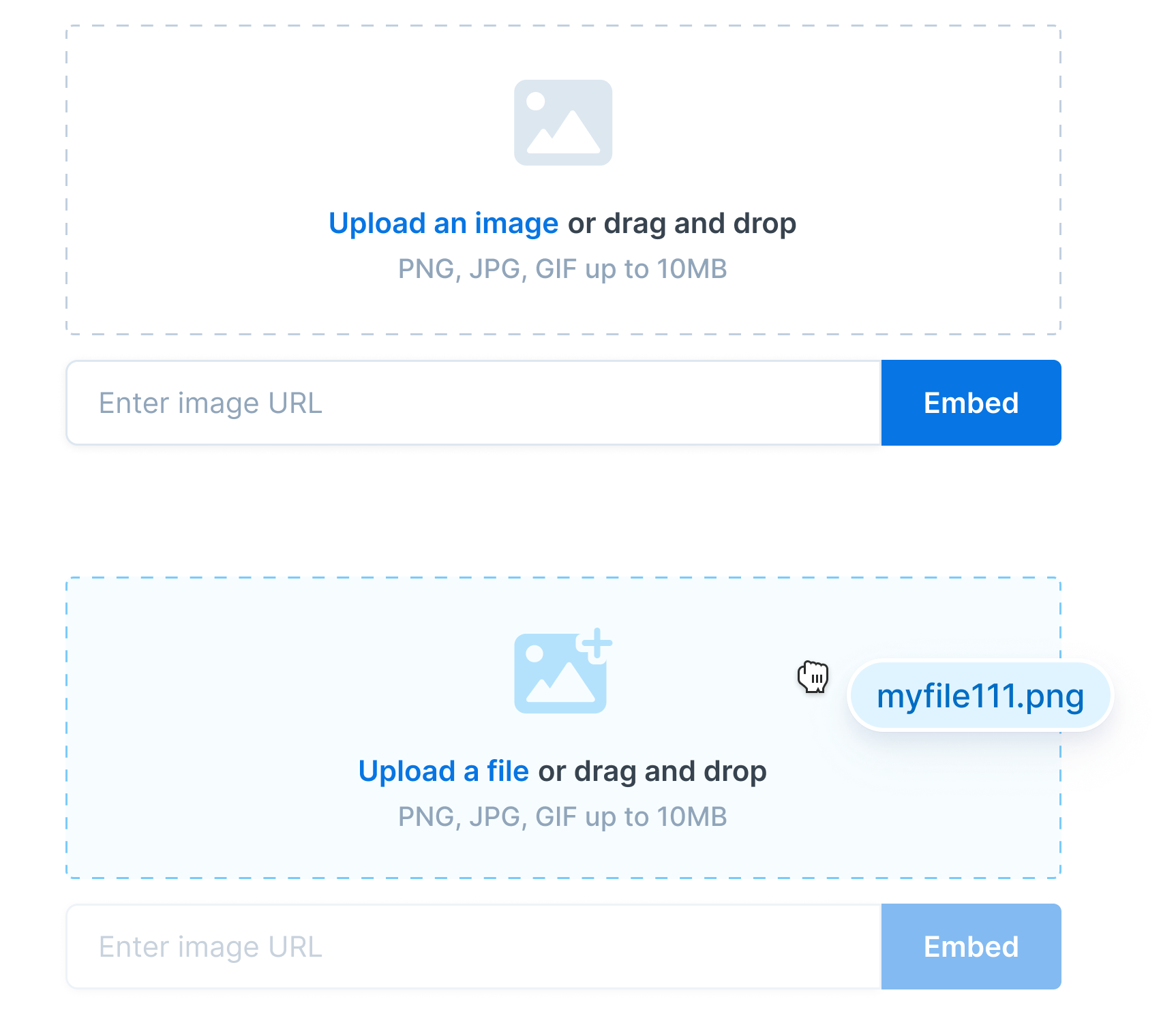
To make this easy and quick for users, show them an empty state with:
- A clear call to action, such as "Add an image", or "Select a recipe"
- Details about what kind of data your block will accept and any limitations, such as "Accepts PNG or JPEG under 25MB"
- A clear button or input element where they can search for data, select from a list, upload a file, or add a URL
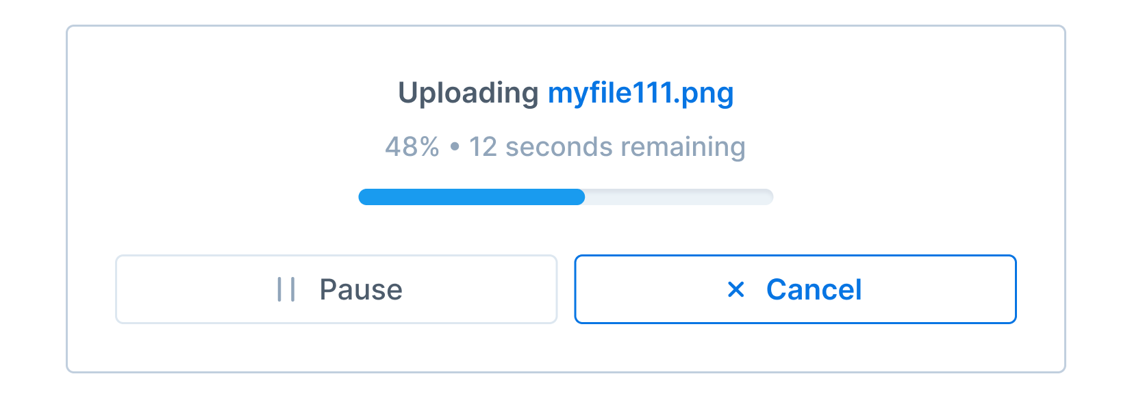
Once they have entered or selected data, ensure you design a loading state that lets them know if they need to wait a moment for the data to load. If the loading process might take a while, giving them buttons to pause and resume may also be a good idea. Giving users clear feedback and visibility of system status helps them feel informed and in control.
4. Create generous touch targets
Touch targets are any area of the screen users will need to click — buttons, icons that trigger actions, or links.
Humans have fat little fingers and we're bad at accurately poking them at screens. On mobile devices, you should make sure any clickable elements are at least 44px wide and high. We're better at hitting targets in the middle of the screen than ones on the edges, so you can get away with slightly smaller targets if your icon or button is bang in the middle.
This doesn't mean the icons and text on buttons need to be that large – only the clickable space around it.
We're more accurate when manoeuvring a cursor onto a target on desktops, but not by much. Clickable targets should be at least 40px wide and high. You can be sensibly flexible with this; if you have a button that is only 30px high but 200px wide that will do.
The general rule is that larger targets = quicker and easier to click.
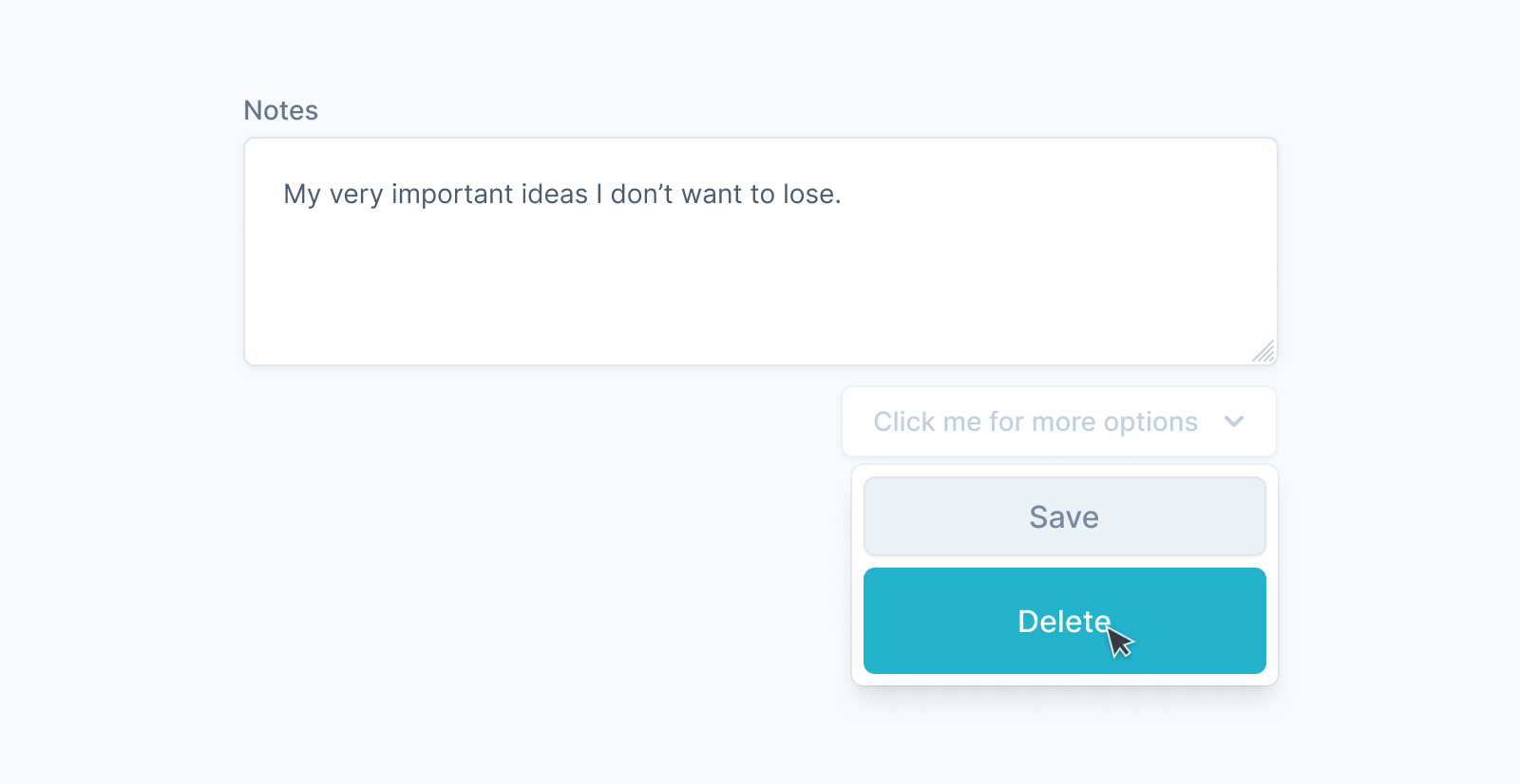
5. Make interactive and editable elements obvious
If the user can click, edit, manipulate, or input data anywhere in the block, you should visually style the element in a way that makes clear it's interactive.
This means making buttons look like buttons by giving them a different background color and clear border.
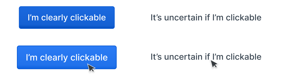
It means making input fields look like input fields by giving them a border and either a subtle inner shadow or drop shadow to help them stand out. It means adding tooltips and hover styles when a user mouses over something they can act upon.
This approach of using subtle depth, lighting, and color cues to indicate which elements on a page are interactive has been named "Flat 2.0" design – an evolution of the original "flat design" trends that had many usability issues and are less popular today.
Using indicators of depth like drop shadows, inner shadows, and layering helps users understand how interface elements are related and what they can interact with. We don't have to go back to full-on skeuomorphic design. We just need to offer a few hints to make it obvious what can and can't be interacted with in our blocks.
6. Make your blocks A11y accessible
A11y accessibility covers a wide range of design practices that help make web interfaces easier to use for everyone. Especially people who might be visually, physically, or cognitively impaired while they're using your block.
The a11y project has a great checklist you can work through to make sure your blocks meet the basic requirements.
The most common mistakes in this department are usually related to color choices and contrast levels. Any essential text, icons, and elements in your block should have a contrast rating that meets AA standards. That means the contrast ratio between the foreground and background needs to be 3.0:1 for all borders, icons, and text larger than 18px and 4.5:1 for all text smaller than 18px.
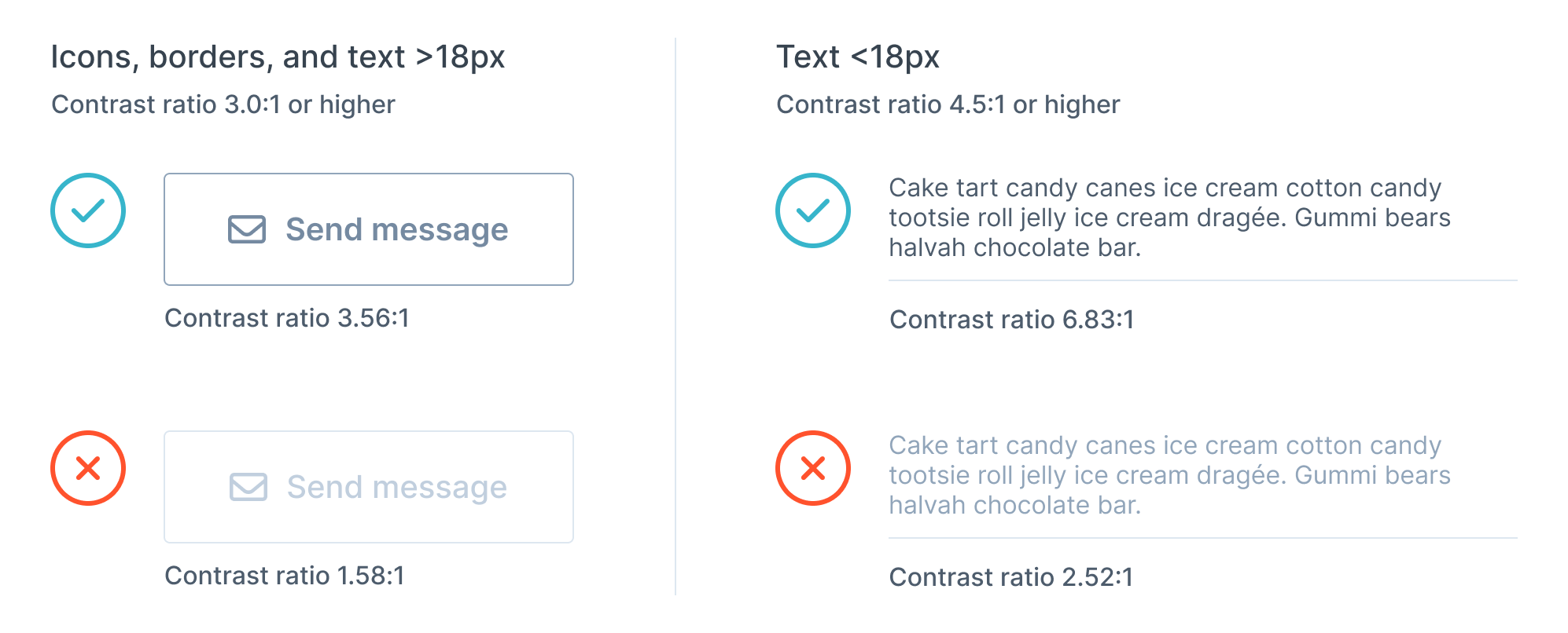
To test the contrast levels of your palette, you can use sites like colourcontrast.cc. If you're designing mockups in Figma, plugins like Stark can help automatically check designs for you.
7. Co-locate data and actions
Whenever the user can edit or manipulate data within the block, place the button or element that triggers that action as close to the data as possible.
If a user is filling in a form, place the "submit" button right next to the last field. If a user is applying a set of filters, place the "apply filters" button right next to the selectors. You can also use containers and spacing to indicate a button is closely related to an area of input.
8. Direct manipulation
A close cousin of co-location, direct manipulation is when we allow users to directly touch and move elements on the screen to change their state. As humans with bodies, we are very used to touching and moving physical objects to manipulate them. Whenever we want to change a digital object we have the same instinct – we try to touch it (or at least, the visual representation of it on our screens).
When we have to use a control or input element that is physically separated or distant from the data being acted upon, we're more likely to be confused about what we're editing.
9. Follow conventional icon semantics and use labels
We strongly recommend you use icons in your blocks. They help reinforce meaning on buttons and menus, and work as visual cues that users can quickly scan. It's also important that you use icons from a well-designed and consistent library. Here are a few great libraries to consider: Font Awesome, Feather Icons, and Hero Icons.
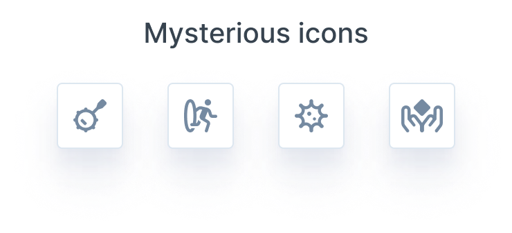
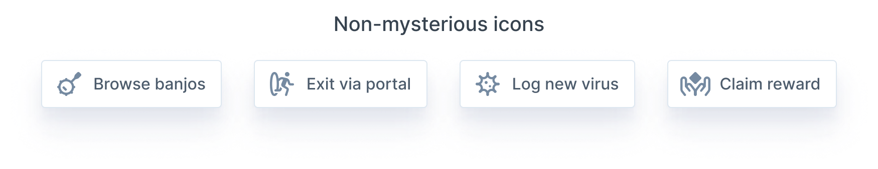
You should use conventional icons that users have seen before. While there are no guaranteed universal icons, it's safe to assume users will recognize the magnifying glass for search 🔍, gear icon for settings ⚙️, and down/up/left/right icons ⬆ ⬇ for navigational menus and buttons.
You should also be cautious about using non-conventional or novel icons. There's nothing less enticing than a mysterious icon in the corner of an app that gives you no indication of what it might do. Take you to a new page? Delete all the data you just entered? Who knows!
The easiest way to solve this is to always put text labels next to icons. This prevents users from having to guess what the icon means. This is especially important if you're using icons that aren't widely used in other applications.
Since we live in a world where we don't have infinite screen space, it can be tricky to fit labels on everything. You can always put labels inside tooltips that appear when a user hovers over the icon. This is a better solution for desktop than mobile, as we can't hover with our fingers (yet... still waiting for Apple to figure that one out). For mobile screens, simply display the label inline.
Working with designers
At this point, some of you might be overwhelmed by the number of things you need to consider when designing blocks. Design is hard! There's a reason it's a specialized profession that takes decades to master.
If you're working on a block and you want it to be really great, you should find a designer to come work on it with you. There sadly aren't many designers involved in open source projects, often because of the time commitment it takes to fully understand a project and what it needs. It isn't as easy to hop in and start contributing design work in the same way we can with code. Thankfully, block-sized projects are smaller in scope than most OS ventures. They also have an explicit need for great UX and visual design. Which makes them the perfect side project to pitch to your designer friends.
Get new posts in your inbox
Get notified when new long-reads and articles go live. Follow along as we dive deep into new tech, and share our experiences. No sales stuff.